The SEO Penalty of Bad UI
In our previous article, we discussed breaking out of the "Google Sandbox" using Programmatic SEO. But getting Google to crawl your site is only half the battle. If your platform suffers from poor Core Web Vitals, Google will actively penalize your search rankings. The two most common offenders in modern web development are LCP (Largest Contentful Paint) and CLS (Cumulative Layout Shift).
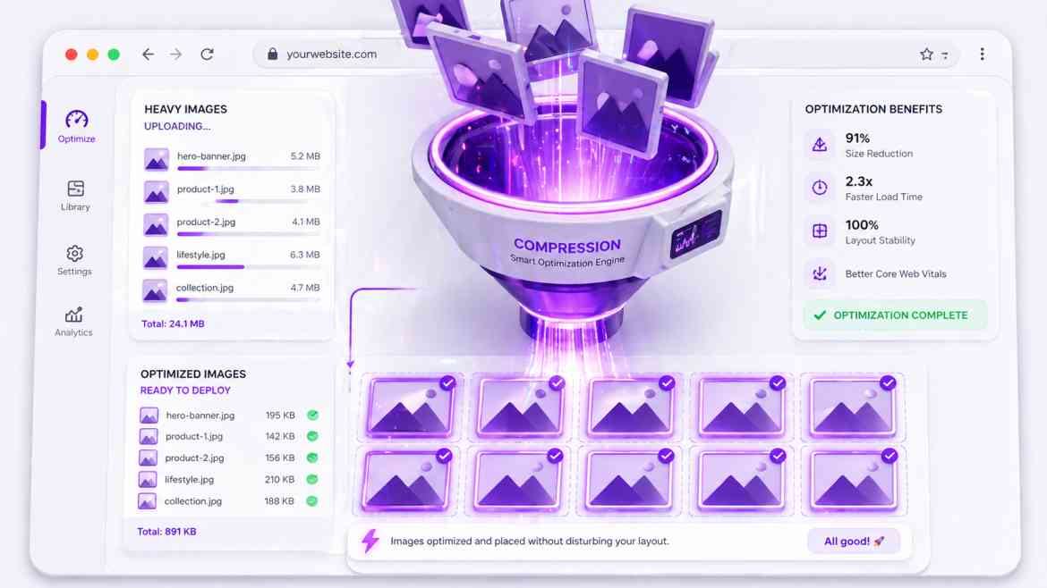
These metrics are almost always destroyed by one thing: poorly managed images. If a hero image loads slowly (ruining LCP) or if an image suddenly pushes your text down the screen as it loads (causing CLS), users bounce and search engines downrank you. At Smart Tech Devs, we solve this entirely by leveraging the Next.js <Image> component.
Eliminating CLS with Strict Dimensions
Cumulative Layout Shift occurs when the browser doesn't know how much space an image will take up until it finishes downloading. To fix this, you must explicitly declare the aspect ratio so the browser can reserve the exact pixel space before the image arrives.
// ❌ THE ANTI-PATTERN: Causes massive layout shifts
// <img src="/dashboard-preview.png" alt="SaaS Dashboard" />

// ✅ THE ENTERPRISE PATTERN: Next.js Image
import Image from 'next/image';

export default function HeroSection() {
    return (
        <div className="hero-container">
            {/* The browser reserves exactly 1200x630 pixels instantly */}
            <Image
                src="/dashboard-preview.png"
                alt="SaaS Dashboard Preview"
                width={1200}
                height={630}
                className="rounded-lg shadow-xl"
                // Priority tells Next.js to preload this image immediately (Fixes LCP)
                priority
            />
        </div>
    );
}
Responsive Scaling without Bloat
If you upload a 4K image to your server, serving that 4K file to a user on a 3G mobile connection is disastrous. Next.js automatically solves this by optimizing images on-demand. When you use the <Image> component, Next.js converts the image to modern formats like WebP or AVIF and serves perfectly sized versions based on the user's device.
Mastering the `sizes` Attribute
For responsive images where you don't know the exact pixel width (e.g., a fluid grid of blog post thumbnails), you must use the fill property combined with the sizes attribute. This tells the browser exactly which compressed image file to download.
import Image from 'next/image';

export default function BlogThumbnail({ imageUrl }) {
    return (
        // The parent container MUST be relative
        <div className="relative w-full aspect-video">
            <Image
                src={imageUrl}
                alt="Blog Post Thumbnail"
                fill
                className="object-cover"
                // Tells the browser: On mobile it takes 100vw, on tablets 50vw, on desktop 33vw.
                // Next.js uses this to serve the smallest possible file!
                sizes="(max-width: 768px) 100vw, (max-width: 1200px) 50vw, 33vw"
                quality={80} // Compress slightly for faster loading
            />
        </div>
    );
}
Conclusion
Search engines rank user experience, and images dictate UI performance. By strictly utilizing the Next.js <Image> component with correct dimension reservations and priority loading, you eliminate layout shifts, slash your LCP times, and provide the technical foundation required to rank on the first page of Google.