The Limitation of Screen-Based Breakpoints
Standard responsive design depends on CSS Media Queries (like Tailwind's md:grid-cols-2 or lg:grid-cols-3). Media queries check the global viewport size (the width of the entire device screen) to determine how components should rearrange themselves.
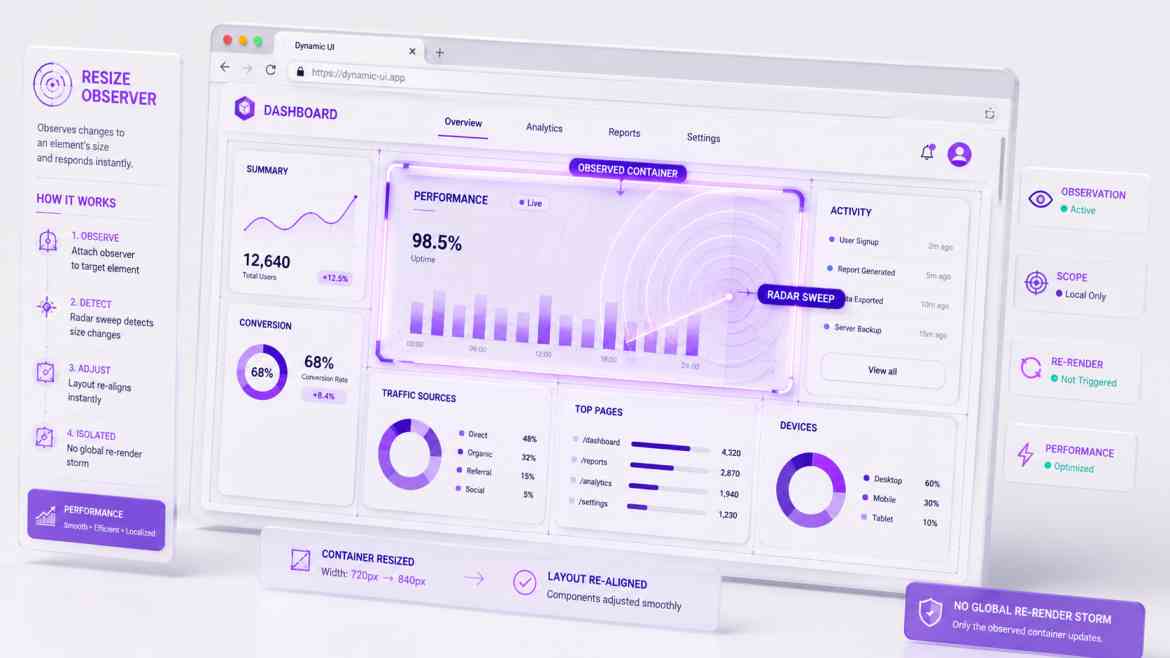
In data-dense B2B dashboards, viewport metrics are fundamentally inadequate. Imagine you are building a complex data visualization widget. This widget might be dropped into a massive 3-column main grid, or it might be squeezed into a tiny side drawer layout. If you use a media query, the widget checks the screen size, thinks it's on a desktop, and tries to render in a wide format—completely breaking and overflowing its narrow container container. To build true layout-agnostic interfaces, components must react to the size of their immediate container, not the viewport.
The Performance Solution: ResizeObserver & Container Queries
Modern browser architectures provide two exceptional tools to solve this: CSS Container Queries (for styling shifts) and JavaScript ResizeObservers (for handling dynamic script logic or conditional component rendering when shapes morph).
Step 1: Implementing CSS Container Queries
Container queries allow an element to style its children based solely on its own parent box dimensions. In Tailwind CSS, you enable this by declaring a container context.
{/* 1. We designate this wrapper box as a named container context */}
<div className="@container w-full max-w-sm lg:max-w-4xl border p-4">
    <div className="grid grid-cols-1 @lg:grid-cols-3 gap-4">
        {/* 2. This layout splits into 3 columns ONLY if the parent component wrapper
            itself is greater than 32rem (@lg), completely independent of screen size! */}
        <div className="p-4 bg-gray-50">Metric A</div>
        <div className="p-4 bg-gray-50">Metric B</div>
        <div className="p-4 bg-gray-50">Metric C</div>
    </div>
</div>
Step 2: Building a Custom `useResizeObserver` React Hook
If your React dashboard components need to completely change their conditional logic or toggle complex Canvas charting parameters when a box resizes, you need a high-performance hook that wraps the browser's native ResizeObserver API without causing heavy rendering lag loops.
// hooks/useResizeObserver.ts
"use client";

import { useEffect, useState, useRef } from 'react';

export function useResizeObserver() {
    const [dimensions, setDimensions] = useState({ width: 0, height: 0 });
    const targetRef = useRef<HTMLDivElement | null>(null);

    useEffect(() => {
        if (!targetRef.current) return;

        // 1. Initialize native browser observer
        const observer = new ResizeObserver((entries) => {
            if (!entries || entries.length === 0) return;

            const { width, height } = entries[0].contentRect;
            // 2. Record dimension metrics smoothly
            setDimensions({ width, height });
        });

        // 3. Begin monitoring the element layout bounds
        observer.observe(targetRef.current);

        return () => {
            // Cleanup: Sever observation connections when unmounting
            observer.disconnect();
        };
    }, []);

    return { targetRef, dimensions };
}
The Engineering ROI
Moving from screen-based breakpoints to element-based observation unlocks total architectural decoupling. Your dashboard panels, reporting summaries, and graphs become entirely self-contained boxes. They can be embedded anywhere within your SaaS—inside popups, sidebars, expandable drawers, or multi-column grids—and they will instantly adapt their layout flawlessly with zero visual layout shifts or layout computation breakdowns.